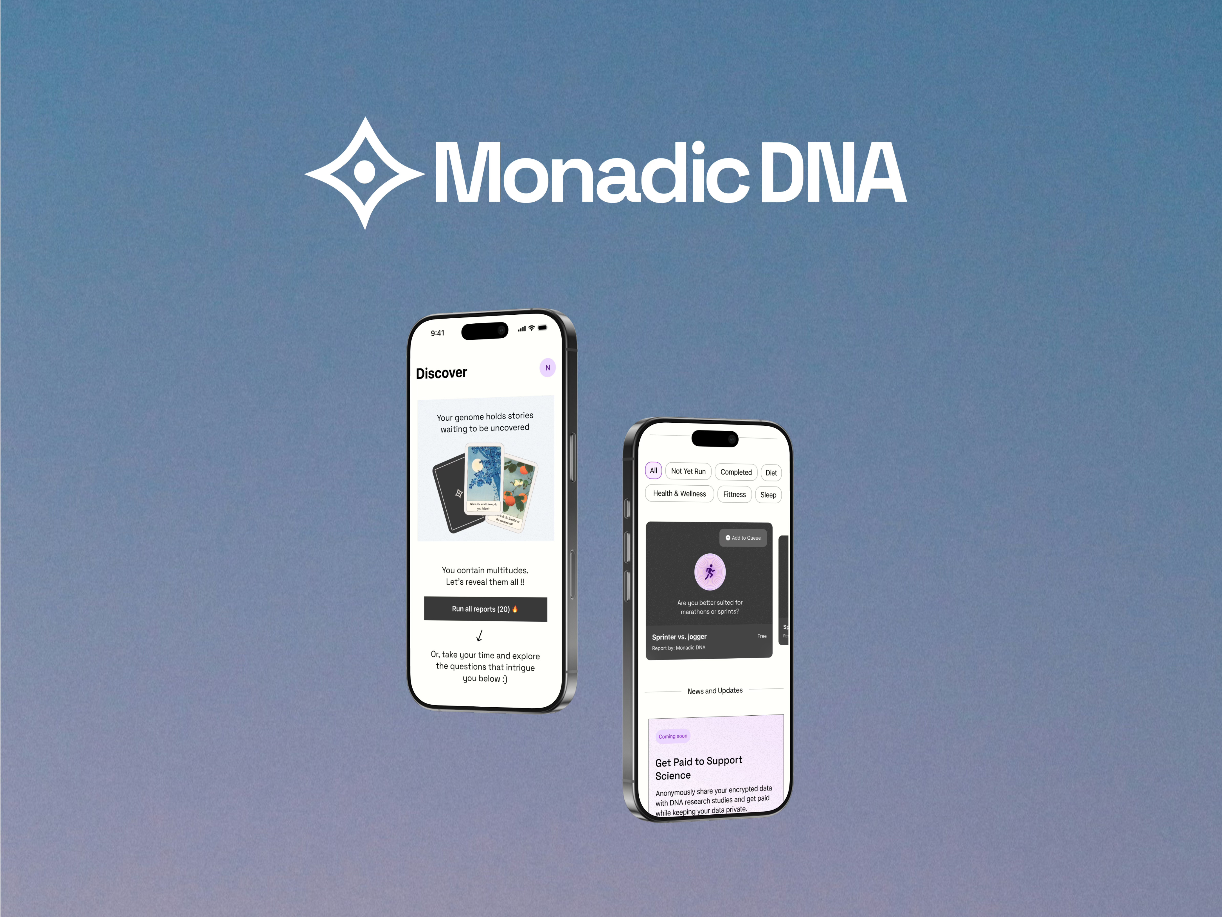
Designing a Consumer Genomics App in a New Era of Encrypted Technology
Piloted in March 2025 with the world’s first encrypted sequencing cohort. Thirty people bacame the first people in history to have their DNA analyzed through encrypted computation.
At a Glance


What We Built
A consumer mobile app, web app and service for privacy-focused personal genonimcs.


Design Goal
Make a complex domain feel approachable, fun, and trustworthy.

Impact
Established UX patterns for user-owned DNA data. Proved privacy-preserving genomics can work at scale.

Retrospective Lessons
Designing for trust means designing for clarity and understanding.
Introduction
The idea for Monadic DNA grew out of conversations, side quests, and hard-to-ignore facts about current genomic data privacy. After a successful proof-of-concept at ETHGlobal 2024, we set out to design with a clear ethos: your DNA data is yours. At ETHDenver 2025, that vision became reality in a historic pilot: thirty participants became the first people ever to have their DNA sequenced, encrypted, and analyzed through our app proving that privacy-preserving genomics can work in practice and shaping how we approached service as well as interface design.
Role
- End-to-end Product Design
- User Research
- Branding
- Design System Creation
- Interaction Design
Domain
- B2C Mobile App
- Data Privacy Tech
- DeSci
Problem
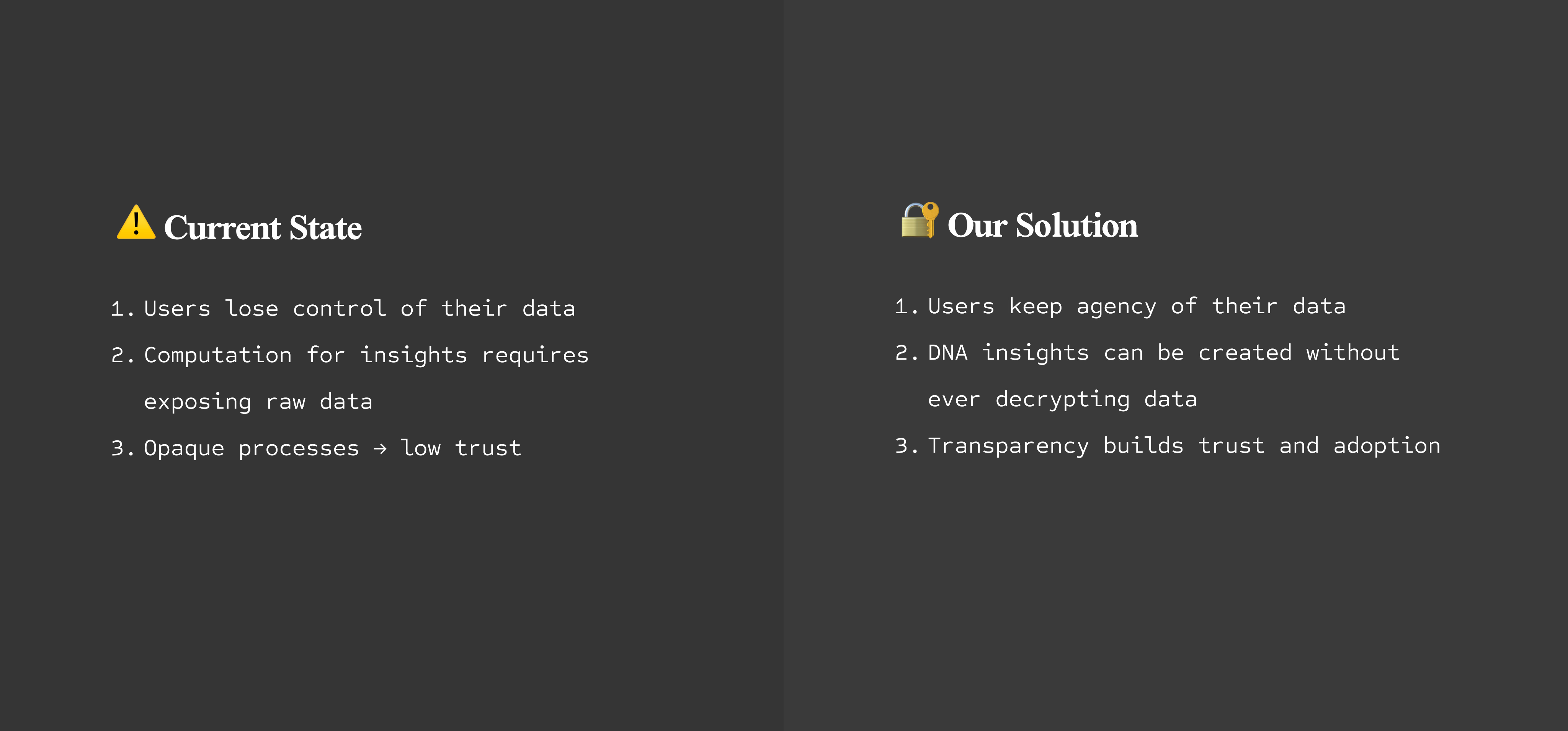
User ProblemPeople want DNA insights, but don’t trust apps that upload sensitive data to third-party servers. They lose control once their data leaves their device. Recent consumer DNA data breaches show the risks are real and costly.
Business/Technical ProblemNew encryption methods (FHE + MPC) solve privacy risks but introduce latency and complexity. Without thoughtful design, the product risks feeling confusing, or untrustworthy, blocking adoption.
Research and Insights
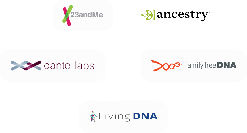
Competative Analysis Key Takeaways

- Centralized storage leaves users with little control once files are uploaded.
- Monetization often depends on subscriptions or selling aggregated data to partners, with limited transparency
- None of the major players offer encrypted computation or true user-owned data leaving a clear opportunity space.
Competative Analysis Key Takeaways
Branding For Trust & Curiosity
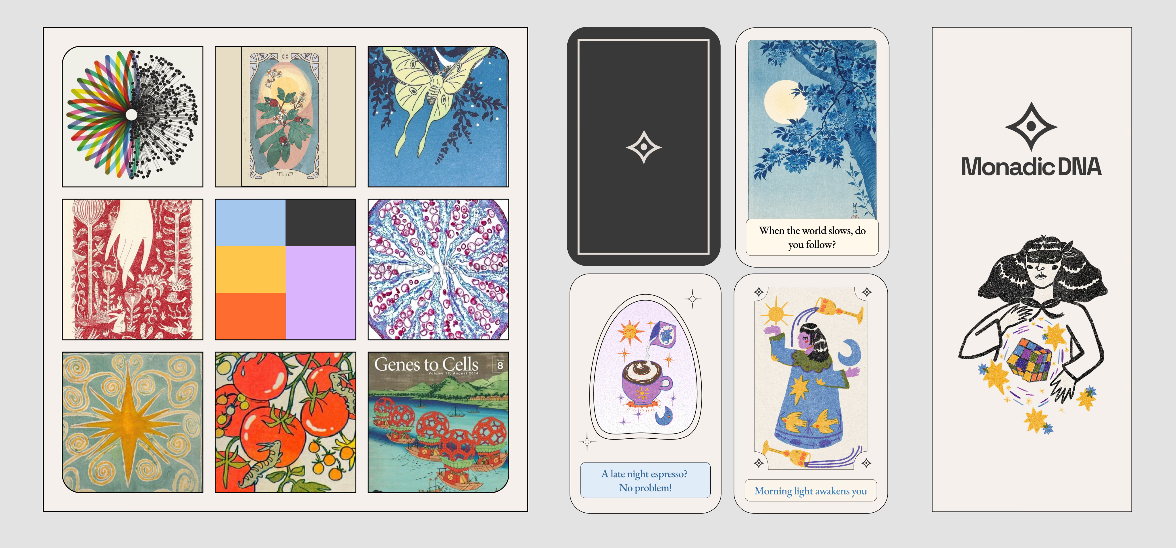
Fig. B: From left to right: moodboard, insight card examples, and the app homepage illustration. Branding, logo, and graphic assets by me. App illustrations by the talented @celia.b.studio
Through product discussions, we decided that the mobile app wouldn’t include DNA analysis results that require a doctor or genetic counselor to interpret. Those types of results are in a separate track, developed alongside medical experts. The mobile app focuses on playful “insights” that spark curiosity.While researching I noted that most consumer-focused genomics apps go for a clinical and sterile aesthetic. I instead leaned into the idea that DNA and blind computation technology don’t have to be strictly “lab coat” coded, they can be grand, mysterious and warm. The visual tone is organic and warm, inspired by the aesthetics of tarot and grounded in the spirit of scientific inquiry.
Loading Screens as Quiet Onboarding
Designing onboarding is tricky. Its effectiveness is debated, and users often skip it. In our case, the app needed a moment to generate encryption keys upon account creation. I used this loading time to introduce the core concepts of privacy and data ownership using the visual metaphors of vaults and keys.With simple language and visuals, I hinted at how Fully Homomorphic Encryption (FHE) and Multi-Party Computation (MPC) work without getting overly technical. These helped users start to understand that their data stays private even while it’s being analyzed. It’s a quietly potent shift in how we think about data sharing.
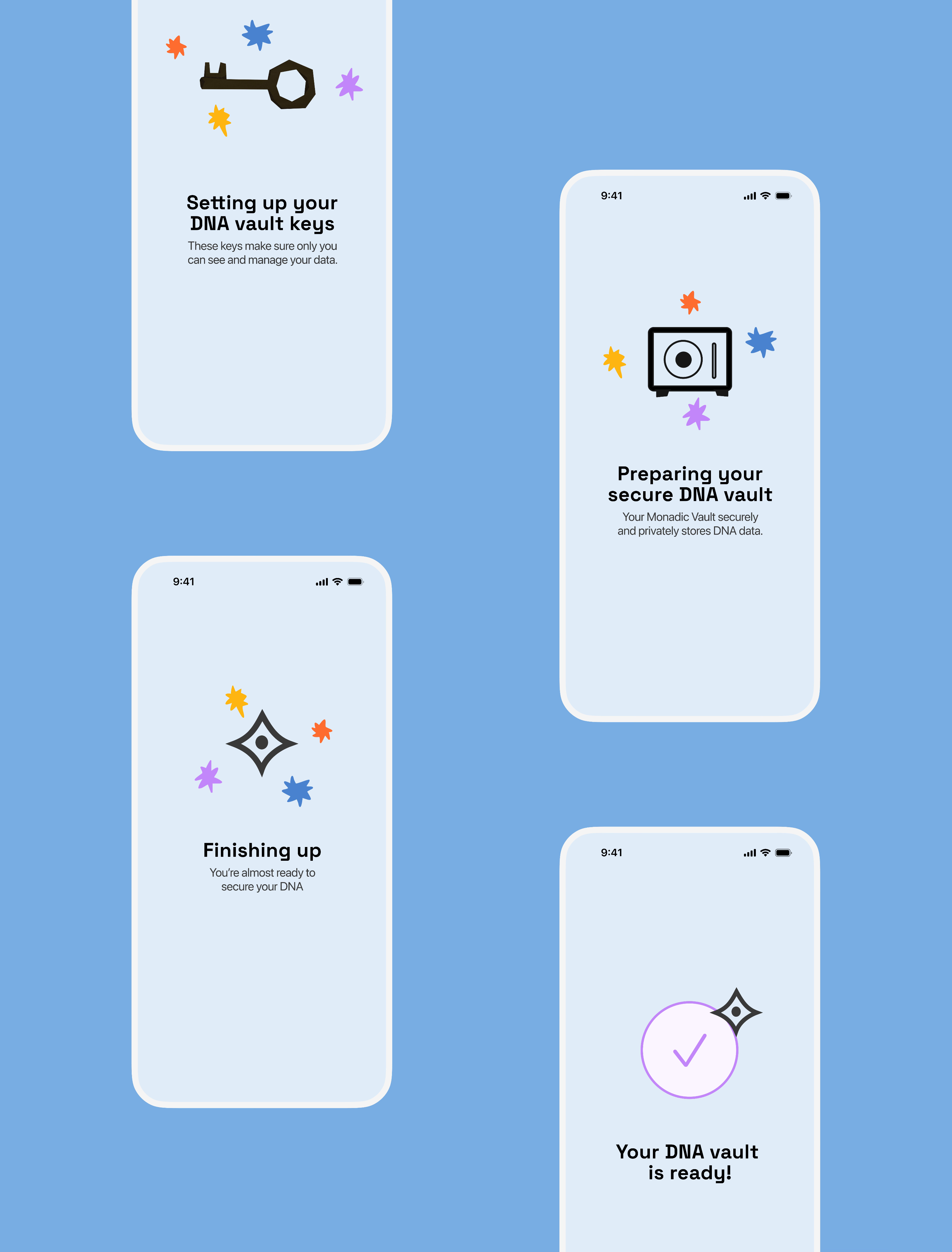
Fig. C: Loading Screens
How Copy, Tone, and Hierarchy Refinement Improved UX
The first version of the app was catered for a technical demo, so a lot had to change when we turned it into a mobile app. Still, some early testing was welcome. In the earlier version, the info was technically accurate, but testing revealed that users would interpret "risk" as a diagnosis. This feedback shaped how I redesigned the experience. I flipped the hierarchy to start with the user’s result and reworked the tone to feel narrative driven and clear. We focused each insight around the outcome in a way that invited curiosity rather than concern.
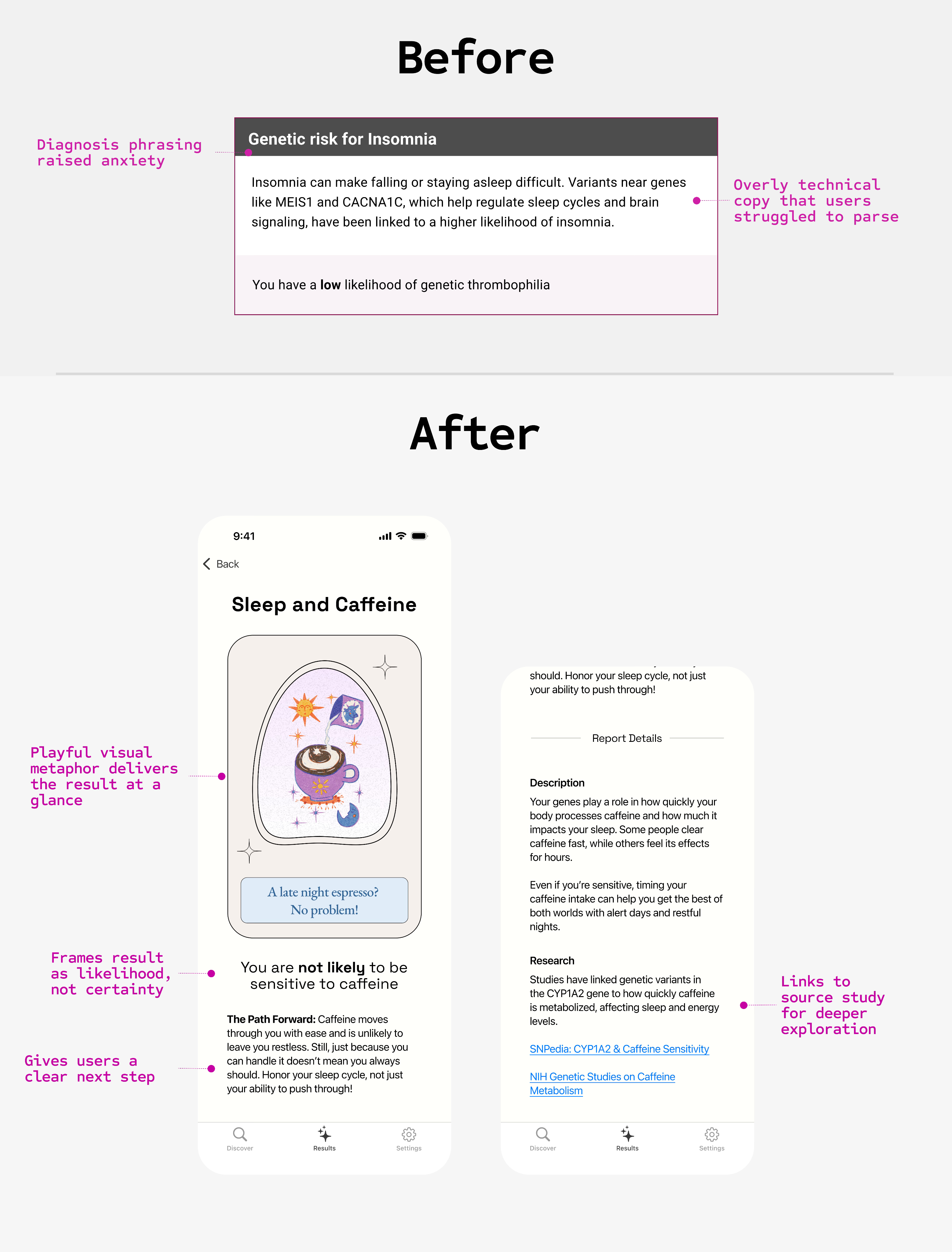
Fig. D: Results screen before and after redesign
Coming from “decentralized tech world,” I’m used to working in a domains where exposing raw data is a gold standard for earning trust with users. But even in those contexts, the manner in which the information is presented shapes how people interpret it. This was a good reminder that even in seemingly simple flows, thoughtful design isn’t about hiding complexity, but rather about giving people the right tools to explore it.
Fig E: Byte magazine, Feb 1985, “Computing and the Sciences.” Cover by Robert Tinney.
Designing Features That Can Scale With The Product

Fig. F: Switching profiles flow
Our first demo results screen targeted a technical audience. It led with labels that indicated the program we ran like “Genetic Risk for Insomnia” and included scientific links for credibility. In early user testing, I saw a pattern that people misinterpreted "risk" as a diagnosis. That language caused anxiety, even when the outcome was positive. The issue wasn’t the data emperically, it was how we presented it.
For the mobile app, I reframed that screen completely. I flipped the hierarchy to lead with the user’s actual result first, and rewrote the tone to be narrative and friendly, not clinical. Scientific links remained accessible—but only after the user felt grounded. The headline shifted from risk categories to phrases like “Your genetics suggest stable sleep patterns”, which invited curiosity, not concern.
This change aligned with our hypothesis: that clarity and tone shape trust.
Designing a Clear Ask
This might seem like a small copy tweak, but it points to the realities of building with FHE. Every computation runs on encrypted data, so some reports can take hours to complete. In a health-adjacent context this is normal since people are used to waiting for lab results. For a mobile app, the wait needs more context. The interface’s role here is to make that latency easy to work with so the privacy gains outweigh the trade-offs.
The original notification prompt tried to cover processing times, monetization, and future features at once. I rewrote it to answer one question: why should I do this now? The result was less noise and a clearer path to completing an action that benefits users later.
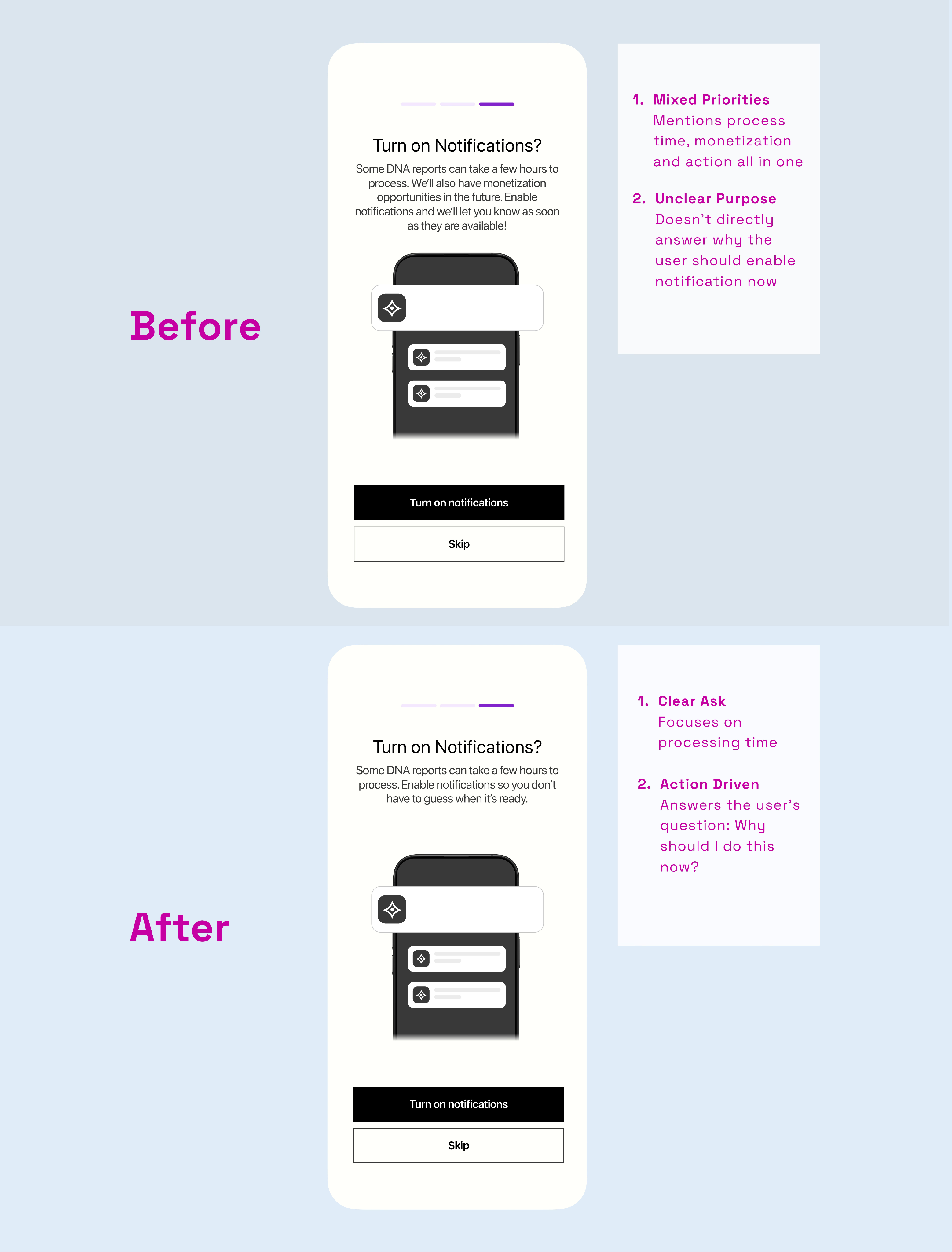
Fig. G: Results screen before and after redesign
Web App Demo

2025
Designing a Consumer Genomics App in a New Era of Encrypted Technology
Piloted in March 2025 with the world’s first encrypted sequencing cohort. Thirty people bacame the first people in history to have their DNA analyzed through encrypted computation.
At a Glance


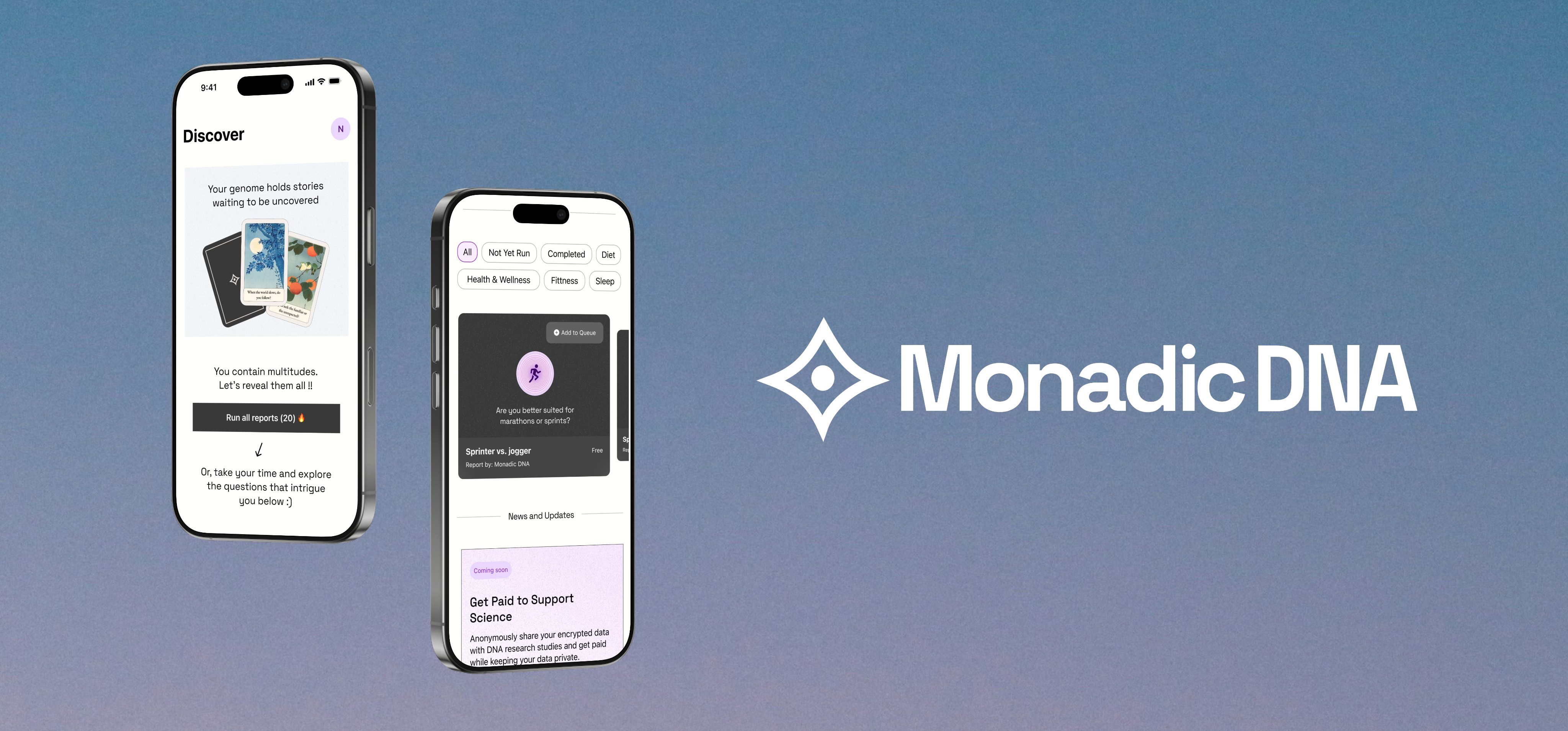
What We Built
A consumer mobile app, web app and service for privacy-focused personal genonimcs.


Design Goal
Make a complex domain feel approachable, fun, and trustworthy.

Impact
Established foundational UX patterns for user-owned DNA data flows. Piloted the world’s first encrypted genomic analysis cohort.

Retrospective Lessons
Designing for trust extends beyond screens. Every touchpoint must reassure people that their data is safe, private, & respected.
Introduction
The idea for Monadic DNA grew out of conversations, side quests, and hard-to-ignore facts about current genomic data privacy. After a successful proof-of-concept at ETHGlobal 2024, we set out to design with a clear ethos: your DNA data is yours. At ETHDenver 2025, that vision became reality in a historic pilot: thirty participants became the first people ever to have their DNA sequenced, encrypted, and analyzed through our app proving that privacy-preserving genomics can work in practice and shaping how we approached service as well as interface design.
Role
- End-to-end Product Design
- User Research
- Branding
- Design System Creation
- Interaction Design
Domain
- B2C Mobile App
- Data Privacy Tech
- DeSci
Problem
User ProblemPeople want DNA insights, but don’t trust apps that upload sensitive data to third-party servers. They lose control once their data leaves their device. Recent consumer DNA data breaches show the risks are real and costly.
Business/Technical ProblemNew encryption methods (FHE + MPC) solve privacy risks but introduce latency and complexity. Without thoughtful design, the product risks feeling confusing, or untrustworthy, blocking adoption.
Research and Insights
Competative Analysis Key Takeaways
- Centralized storage leaves users with little control once files are uploaded.
- Monetization often depends on subscriptions or selling aggregated data to partners, with limited transparency
- None of the major players offer encrypted computation or true user-owned data leaving a clear opportunity space.
Branding For Trust & Curiosity
Fig. B: From left to right: moodboard, insight card examples, and the app homepage illustration. Branding, logo, and graphic assets by me. App illustrations by the talented @celia.b.studio
Through product discussions, we decided that the mobile app wouldn’t include DNA analysis results that require a doctor or genetic counselor to interpret. Those types of results are in a separate track, developed alongside medical experts. The mobile app focuses on playful “insights” that spark curiosity.While researching I noted that most consumer-focused genomics apps go for a clinical and sterile aesthetic. I instead leaned into the idea that DNA and blind computation technology don’t have to be strictly “lab coat” coded, they can be grand, mysterious and warm. The visual tone is organic and warm, inspired by the aesthetics of tarot and grounded in the spirit of scientific inquiry.
Loading Screens as Quiet Onboarding
Designing onboarding is tricky. Its effectiveness is debated, and users often skip it. In our case, the app needed a moment to generate encryption keys upon account creation. I used this loading time to introduce the core concepts of privacy and data ownership using the visual metaphors of vaults and keys.With simple language and visuals, I hinted at how Fully Homomorphic Encryption (FHE) and Multi-Party Computation (MPC) work without getting overly technical. These helped users start to understand that their data stays private even while it’s being analyzed. It’s a quietly potent shift in how we think about data sharing.
Fig. C: Loading Screens
How Copy, Tone, and Hierarchy Refinement Improved UX
The first version of the app was catered for a technical demo, so a lot had to change when we turned it into a mobile app. Still, some early testing was welcome. In the earlier version, the info was technically accurate, but testing revealed that users would interpret "risk" as a diagnosis. This feedback shaped how I redesigned the experience. I flipped the hierarchy to start with the user’s result and reworked the tone to feel narrative driven and clear. We focused each insight around the outcome in a way that invited curiosity rather than concern.
Fig. D: Results screen before and after redesign
Coming from “decentralized tech world,” I’m used to working in a domains where exposing raw data is a gold standard for earning trust with users. But even in those contexts, the manner in which the information is presented shapes how people interpret it. This was a good reminder that even in seemingly simple flows, thoughtful design isn’t about hiding complexity, but rather about giving people the right tools to explore it.
Fig E: Byte magazine, Feb 1985, “Computing and the Sciences.” Cover by Robert Tinney.
Designing Features That Can Scale With The Product
Fig. F: Switching profiles flow
Our first demo results screen targeted a technical audience. It led with labels that indicated the program we ran like “Genetic Risk for Insomnia” and included scientific links for credibility. In early user testing, I saw a pattern that people misinterpreted "risk" as a diagnosis. That language caused anxiety, even when the outcome was positive. The issue wasn’t the data emperically, it was how we presented it.
For the mobile app, I reframed that screen completely. I flipped the hierarchy to lead with the user’s actual result first, and rewrote the tone to be narrative and friendly, not clinical. Scientific links remained accessible—but only after the user felt grounded. The headline shifted from risk categories to phrases like “Your genetics suggest stable sleep patterns”, which invited curiosity, not concern.
This change aligned with our hypothesis: that clarity and tone shape trust.
Designing a Clear Ask
This might seem like a small copy tweak, but it points to the realities of building with FHE. Every computation runs on encrypted data, so some reports can take hours to complete. In a health-adjacent context this is normal since people are used to waiting for lab results. For a mobile app, the wait needs more context. The interface’s role here is to make that latency easy to work with so the privacy gains outweigh the trade-offs.
The original notification prompt tried to cover processing times, monetization, and future features at once. I rewrote it to answer one question: why should I do this now? The result was less noise and a clearer path to completing an action that benefits users later.
Fig. G: Results screen before and after redesign
Web App Demo

2025
Designing a Consumer Genomics App in a New Era of Encrypted Technology
The first consumer genomics app for encrypted computation piloted in March 2025 at a live event where 30 participants became the first to have their DNA sequenced and analyzed under encryption.
At a Glance


What We Built
A consumer mobile app, web app and service for privacy-focused personal genonimcs.
Design Goal
Make a complex domain feel approachable, fun, and trustworthy.
Impact
Established foundational UX patterns for user-owned DNA data flows. Piloted the world’s first encrypted genomic analysis cohort.
Retrospective Lessons
Designing for trust extends beyond screens. Every touchpoint must reassure people that their data is safe, private, & respected.
Introduction
The idea for Monadic DNA grew out of conversations, side quests, and hard-to-ignore facts about current genomic data privacy. After a successful proof-of-concept at ETHGlobal 2024, we set out to design with a clear ethos: your DNA data is yours. At ETHDenver 2025, that vision became reality in a historic pilot: thirty participants became the first people ever to have their DNA sequenced, encrypted, and analyzed through our app proving that privacy-preserving genomics can work in practice and shaping how we approached service as well as interface design.
My Role (Sole Designer)
- End-to-end Product Design
- User Research
- UI & Visual Design
- Interaction Design
- Branding & Logo Design
Domain
- B2C Mobile App
- Privacy & Security Tech
- Health & Genomics
Problem
User ProblemPeople want DNA insights, but don’t trust apps that upload sensitive data to third-party servers. They lose control once their data leaves their device. Recent consumer DNA data breaches show the risks are real and costly.
Business/Technical ProblemNew encryption methods (FHE + MPC) solve privacy risks but introduce latency and complexity. Without thoughtful design, the product risks feeling confusing, or untrustworthy, blocking adoption.
Research and Insights
Competitive Analysis Key Takeaways

- Centralized storage leaves users with little control once files are uploaded.
- Monetization often depends on subscriptions or selling aggregated data to partners, with limited transparency
- None of the major players offer encrypted computation or true user-owned data leaving a clear opportunity space.
Branding For Trust & Curiosity
Fig. B: From left to right: moodboard, insight card examples, and the app homepage illustration. Branding, logo, and graphic assets by me. App illustrations by the talented @celia.b.studio
Through product discussions, we decided that the mobile app wouldn’t include DNA analysis results that require a doctor or genetic counselor to interpret. Those types of results are in a separate track, developed alongside medical experts. The mobile app focuses on playful “insights” that spark curiosity.While researching I noted that most consumer-focused genomics apps go for a clinical and sterile aesthetic. I instead leaned into the idea that DNA and blind computation technology don’t have to be strictly “lab coat” coded, they can be grand, mysterious and warm. The visual tone is organic and warm, inspired by the aesthetics of tarot and grounded in the spirit of scientific inquiry.
Loading Screens as Quiet Onboarding
Designing onboarding is tricky. Its effectiveness is debated, and users often skip it. In our case, the app needed a moment to generate encryption keys upon account creation. I used this loading time to introduce the core concepts of privacy and data ownership using the visual metaphors of vaults and keys.With simple language and visuals, I hinted at how Fully Homomorphic Encryption (FHE) and Multi-Party Computation (MPC) work without getting overly technical. These helped users start to understand that their data stays private even while it’s being analyzed. It’s a quietly potent shift in how we think about data sharing.
Fig. C: Loading Screens
Fig. D: Results screen before and after redesign
How Copy, Tone, and Hierarchy Refinement Improved UX
The first version of the app was catered for a technical demo, so a lot had to change when we turned it into a mobile app. Still, some early testing was welcome. In the earlier version, the info was technically accurate, but testing revealed that users would interpret "risk" as a diagnosis. This feedback shaped how I redesigned the experience. I flipped the hierarchy to start with the user’s result and reworked the tone to feel narrative driven and clear. We focused each insight around the outcome in a way that invited curiosity rather than concern.
Coming from “decentralized tech world,” I’m used to working in a domains where exposing raw data is a gold standard for earning trust with users. But even in those contexts, the manner in which the information is presented shapes how people interpret it. This was a good reminder that even in seemingly simple flows, thoughtful design isn’t about hiding complexity, but rather about giving people the right tools to explore it.
Fig E: Byte magazine, Feb 1985, “Computing and the Sciences.” Cover by Robert Tinney.
Designing Features That Can Scale With The Product

Fig. F: Switching profiles flow
We discovered through early conversations with potential users that we’d need to account for people managing more than just their own DNA data. For example, parents typically managed their profiles alongside their kids. Accordingly, we focused on making profile switching clear, scalable, and flexible enough to grow with the product.
Each profile has a persistent indicator, color coding, and a switching indication to help users stay oriented. From a product perspective, I treated profiles as distinct user spaces each tied to its own DNA data files. This allowed us to design for future scenarios like shared access and delegated permissions without locking us into a single-user model.
Designing a Clear Ask
This might seem like a small copy tweak, but it points to the realities of building with FHE. Every computation runs on encrypted data, so some reports can take hours to complete. In a health-adjacent context this is normal since people are used to waiting for lab results. For a mobile app, the wait needs more context. The interface’s role here is to make that latency easy to work with so the privacy gains outweigh the trade-offs.
The original notification prompt tried to cover processing times, monetization, and future features at once. I rewrote it to answer one question: why should I do this now? The result was less noise and a clearer path to completing an action that benefits users later.
Fig. G: Results screen before and after redesign
Web App Demo